Annenberg Media - Innovative Design @ USC
My team and I conducted user research to discover navigation issues with the website and redesigned the website to improve the user experience and overall aesthetic.
Annenberg Media
Overview
My team and I conducted user research to discover navigation issues with the website and redesigned the website to improve the user experience and overall aesthetic.
ROLE:
Designer, UX
Researcher
TIMELINE:
February 2022 - April 2022
TOOLS:
Figma, Notion, Google Drive Suite, Slack
TEAM:
Connie Xu, Monica Min, Megan Phi, Kaeli Nguyen
THE PROMPT
Challenge
Our task was to redesign and improve the UI/UX of the current website. We had to take into consideration the limitations of Arc Publishing for our design.
The design should also:
-
increase website traffic
-
streamline the publishing process
-
maintain a professional brand identity
Problem
How might we redesign the website to allow for easier navigation and access to information?
THE QUESTION
MOODBOARDING
Design Research
We studied the website designs of news and media organizations and created a moodboard to draw inspiration for the navigation bar and page layouts.


SURVEY + INTERVIEWS
User Research
We sent out a survey and interviewed editors and faculty who work with Annenberg, as well as individuals outside of Annenberg, to see what hindrances users experienced.
We identified several pain points:
-
repeated sections
-
cluttered navigation bar
-
distracting trending bar
USER PERSONA
Target Audience
-
internal stakeholders: editors, writers, faculty members
-
readers of Annenberg Media
_edited.jpg)
_edited.jpg)

IDEATION
Wireframes
My team and I had weekly deliverables and meetings with the client. We would continuously present designs to the client and improve the design per the client's critiques.


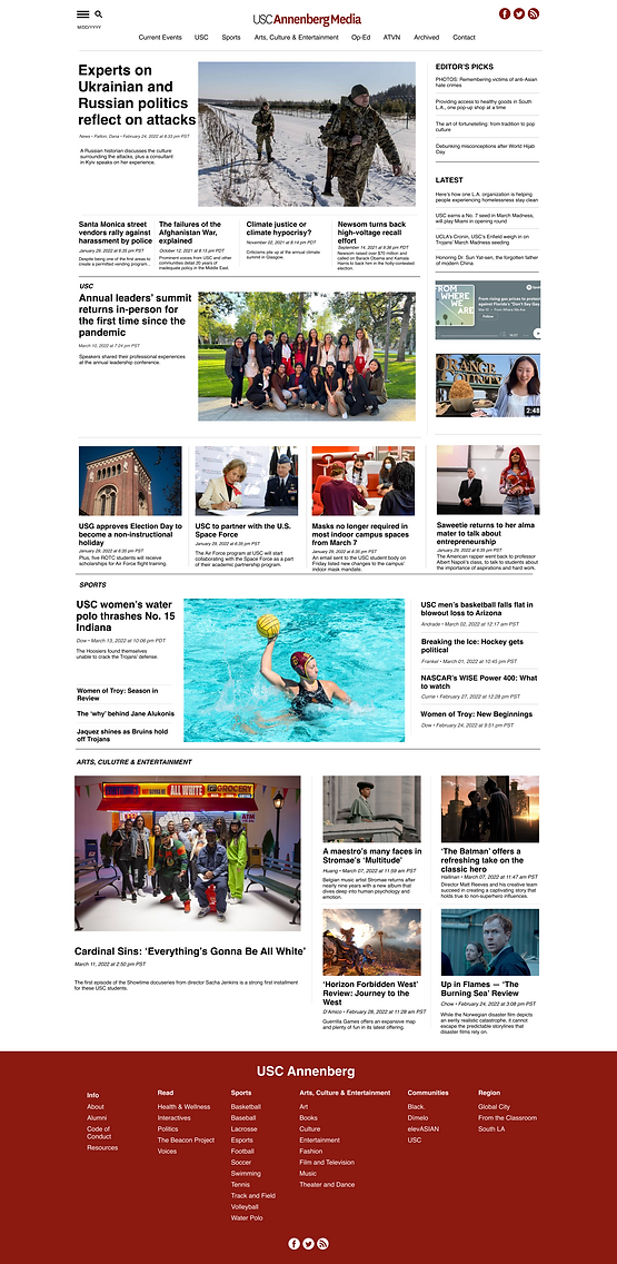
We started by designing the low fidelity layouts of the home, article, and section pages. We decided to increase the white space and margins to increase readability, make the navigation bar static to reduce distractions, and rearrange section placements to minimize redundancy.
After meeting with the client, we changed the footer design by moving the placement of Annenberg Media's socials. We also included relevant article content into our design to find potential navigation or publishing issues to fix.
FINAL PRODUCT
Solution
The newly designed Annenberg Media website creates an improved experience for students and faculty to explore and access information.
01 - HOME PAGE
-
Static navigation bar
-
Many interviewees felt that the navigation bar was very distracting
-
Our team collaborated with the client to handpick specifically relevant topics to remain
-

02 - ARTICLE PAGE
-
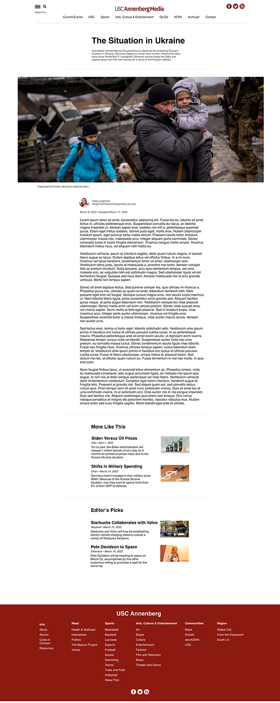
Improved readability for articles
-
Inspired by the Medium, we moved article text to the center of the page and increase white space to help with readability
-
Suggested articles were moved from the side of the page to below the article, available once readers finished reviewing the present article
-

03 - SECTION PAGE
-
Better organized, concise sections
-
We moved the placement of certain sections on the home page to reduce repetition
-
We also trimmed the available topic sections in both the navigation bar and footer for a more simplified way for readers to find relevant information
-
